Albertsons Pilot App
Guiding healthier grocery choices through real-time insights
Key Contributions
Designed information architecture for pharmacy-grocery integration.
Created user flows and wireframes for health management features.
Led competitive analysis and market research.
Developed personas and journey maps for target users.
Ensured accessibility-first design approach throughout.
At a glance
Problem
Customers with chronic health conditions faced a fragmented experience managing wellness. Pharmacy existed separately from grocery shopping.
Outcome
A pilot app that seamlessly integrates nutrition insights into the shopping experience with personalized recommendations.
My role
End-to-end UX, information architecture, user flows, and iterative testing.
Constraints
12-week timeline, health data privacy requirements, existing Albertsons infrastructure, accessibility compliance.
The challenge
Understanding the problem
Customers with chronic health conditions struggled to connect pharmacy guidance with grocery choices. This disjointed experience led to confusion, missed wellness opportunities, and limited progress toward health goals.
Fragmented experience
Pharmacy services and grocery shopping existed in isolation, making it difficult to connect prescriptions with nutritional needs.
Lack of guidance
Customers struggled to identify healthier options while shopping, missing opportunities for better nutrition choices.
Information overload
Health tracking features often existed separately from shopping experience, creating cognitive burden.
Privacy concerns
Users worried about health data privacy and how their information would be used for recommendations.
Amy Rodriguez, 42
Marketing Manager
Manage diabetes while maintaining busy lifestyle. Needs easy access to health data, encouragement, and seamless navigation.
Competitive landscape
CVS Health
Strong pharmacy, limited grocery connection
Walgreens
Wellness tracking separate from shopping
Instacart
No health management features
MyFitnessPal
No shopping integration
Mapping Amy's day-to-day challenges across pharmacy and grocery touchpoints
Design process
From discovery to testing
Through an iterative, user-centered process, I designed a seamless integration of pharmacy services and grocery shopping that respects user privacy and promotes healthier choices.
Note: The client's visual designs stay under NDA, so the artifacts below are the structural work: architecture, flows, and the wireframes the app was built from.
DiscoverResearch and competitive analysis.
DefineInformation architecture and flows.
IdeateWireframing and design exploration.
TestIterative testing and refinement.
Information Architecture
I developed an information architecture that prioritizes frequently accessed features, creates clear pathways between pharmacy and grocery functions, and minimizes steps for key tasks.
User Flows
Designed user flows that streamline prescription refills, enable seamless transitions between pharmacy and grocery shopping, and provide contextual health recommendations.
Wireframes & Iterations
My wireframing process tested different navigation patterns, explored various ways to present health recommendations, and optimized the checkout flow.
Accessibility considerations
Accessibility was a core consideration throughout, ensuring WCAG 2.1 AA compliance and inclusive access for all users.
Visual Design
WCAG 2.1 AA compliant color contrast ratios
Support for text resizing up to 200%
Clear focus indicators for keyboard navigation
Technical Implementation
Semantic HTML structure for screen readers
Alternative text for all meaningful images
Clear error states and form validation
Solution
Key features
A pilot app that seamlessly integrates nutrition insights into the shopping experience, providing personalized recommendations while maintaining shopping flow and privacy.
Integrated Health Tracking
Seamless connection between prescription management and nutritional tracking for comprehensive wellness view.
Personalized Recommendations
Real-time nutrition insights and healthier product alternatives based on user health conditions.
Streamlined Navigation
Simplified navigation structure prioritizing frequently accessed pharmacy and grocery features.
Privacy Controls
Transparent data usage with granular privacy settings for health information management.
Decisions and tradeoffs
What I chose, and what I left off the shelf
Every recommendation in a grocery-health context is a trade between personalization and privacy. These were the calls that shaped the app.
Considered
Deep personalization tied to a long onboarding survey.
Chose
Lightweight cold-start with recommendations that sharpened as users shopped.
Why
Grocery is a high-frequency, low-patience context. Front-loading effort would have killed adoption before the model could learn.
Considered
Recommendations presented as a confident pick.
Chose
Recommendations with a short why, tied to the user's stated goals.
Why
Trust around health data is fragile. A visible rationale converted skepticism into use without slowing the flow.
Considered
Full nutrition panels surfaced on every product.
Chose
A single goal-relevant signal per item, with full detail one tap away.
Why
Density killed scanability in testing. Reducing to one cue per goal preserved decision speed and still rewarded curiosity.
Impact
What the pilot showed
The pilot tested whether pharmacy guidance and grocery choice could work as one flow. Everything below was measured inside moderated sessions rather than in production, and its findings informed Sincerely Health, which Albertsons' in-house team later built and shipped.
84%
Self-reported awareness
Of participants reported increased awareness of healthier options in moderated sessions. What people said, not what a shipped product later measured them doing.
72% substituted in session
Of participants chose a healthier alternative during a moderated session. In-session behavior, on a pilot build, with a facilitator in the room.
Carried into production
The pilot's findings fed Albertsons' in-house team, who went on to build and ship Sincerely Health.
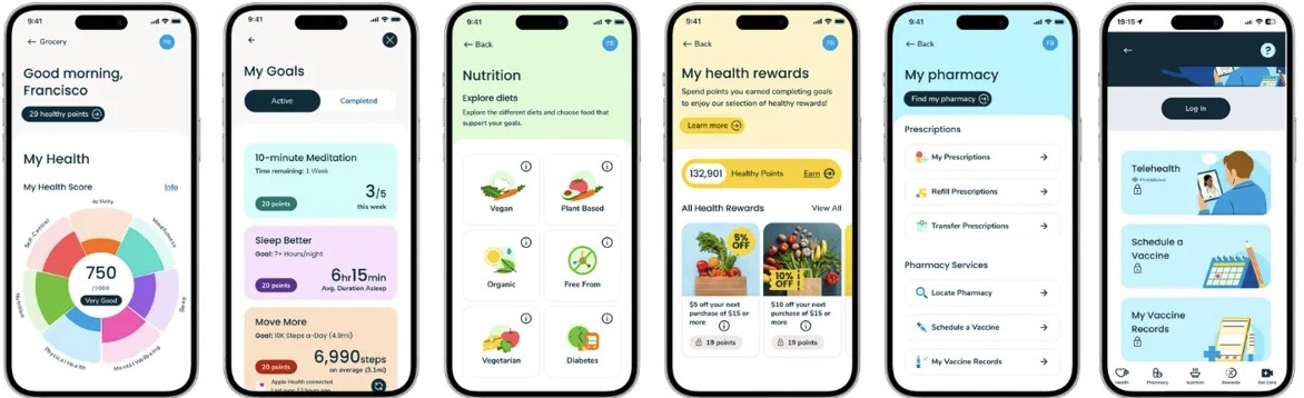
Sincerely Health, designed and shipped by Albertsons' in-house team on the back of the pilot's findings. Not my design work, shown here for where the thinking ended up.
Looking ahead
What I'd do next
Lessons learned
Start with accessibility in mind. It's harder to retrofit inclusive design after the fact.
Cross-functional collaboration is key to solving complex problems that span multiple domains.
Privacy concerns require careful consideration throughout the design process, not as an afterthought.
Future considerations
Integration with wearable devices for real-time health tracking and more personalized recommendations.
AI-powered personalized recommendations based on shopping patterns and health trends over time.
Community features for users with similar conditions to share tips and support each other.
Albertsons reinforced that health-aware design must feel effortless. When wellness guidance integrates naturally into shopping, people make better choices without feeling overwhelmed.
Explore more work
People Skills
Led end-to-end design for AI-inferred skills across M365, Copilot, and Viva: trust and transparency patterns, admin controls, and the design system six product teams shipped against.
trov
A two-sided iOS rental marketplace designed and built solo: product strategy, brand, every screen, the React Native app, and the Postgres backend behind it.
Virtual Appointments
Redesigned scheduling in Microsoft Teams and co-invented Lobby Chat, the U.S.-patented pre-meeting communication feature, cutting no-shows by up to 15% in healthcare and customer service scenarios.
Saver Fare Experience
Mixed-methods research with 60+ participants that shaped the Saver Fare launch, from renaming 'Choice' to 'Main' to the disclosure patterns that made fare restrictions clear before purchase.