Virtual Appointments
Rebuilding scheduling and the visit experience in Microsoft Teams around the moments where no-shows are decided
Key Contributions
Co-invented Lobby Chat, the pre-meeting communication feature granted U.S. Patent 12,418,630.
Led provider and scheduler experience across three core touchpoints.
Defined interaction models and information architecture.
Aligned cross-functional teams across Teams surfaces.
At a glance
Problem
Organizations struggled with fragmented scheduling and confusing join flows that increased no-shows and support burden.
Outcome
A more cohesive journey across scheduling, communications, and the visit experience to increase clarity and confidence.
What I owned
End-to-end UX, interaction model, information architecture, alignment across partner teams.
Constraints
Platform dependencies, enterprise admin needs, accessibility, privacy/security, multi-surface consistency.
Virtual Appointments spans multiple Teams surfaces including scheduling, queue management, communications, and live meeting experiences.
Who this is for
Two user groups, fundamentally different needs
Virtual Appointments bridges the gap between staff who manage appointments and the people who attend them.
Staff & coordinators
Schedule, manage changes, reduce errors under time pressure. Need speed, visibility, and sensible defaults.
Patients & attendees
Understand what to do, join successfully, feel reassured. Need clarity, guidance, and confidence throughout.
Scheduler
Schedulers manage appointments across multiple providers and clients, handling the complex logistics of booking, rescheduling, and coordinating virtual visits. They need efficient tools to reduce clicks, manage availability, and communicate with all parties.
Provider & Scheduler Experiences
I concentrated on three critical touchpoints that significantly impact appointment success rates and user satisfaction.
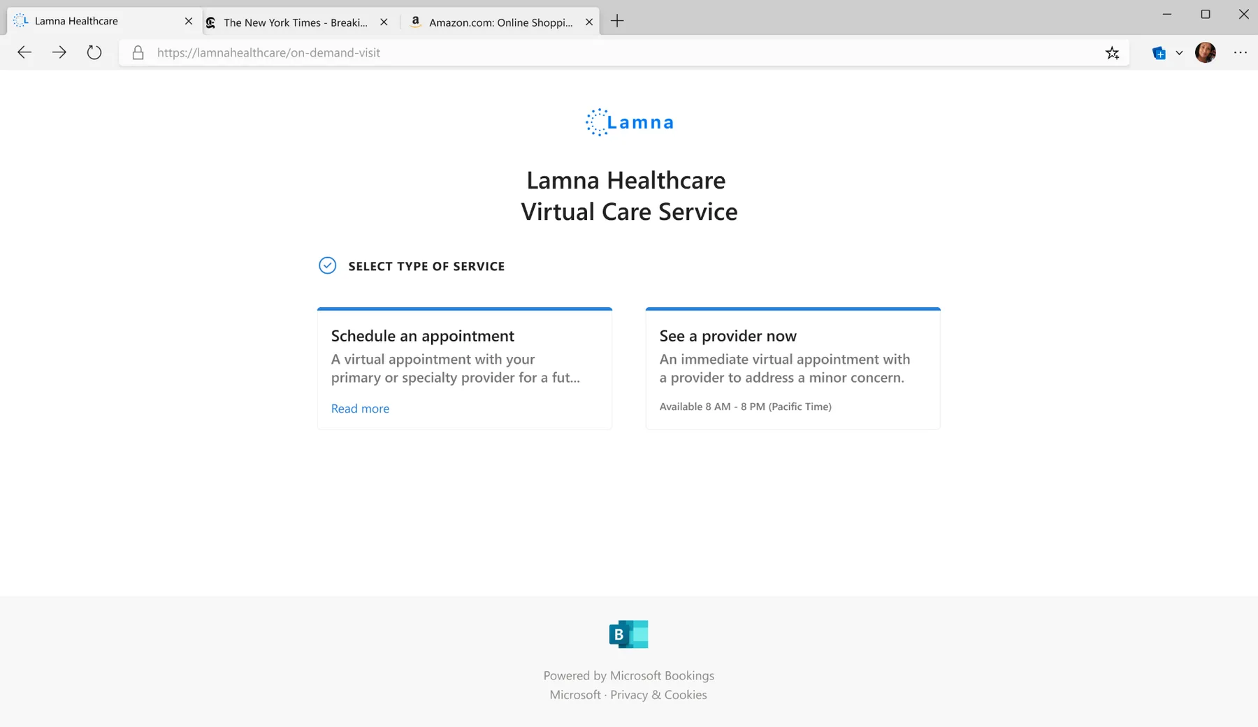
The end-to-end journey
Five stages, five chances to build trust
Each stage of the appointment lifecycle is a moment to build, or lose, confidence.
Schedule
Find a time, book with the right context, get confirmation.
Prepare
Reminders arrive. Expectations are set. Tech is verified.
Join
Clear entry point. No guesswork about where or how.
Conduct
The appointment itself. Focused, productive, human.
Review
Summary, next steps, and a clear record of what happened.
What we learned
Research-backed insights that shaped decisions
High scheduling anxiety
People fear making mistakes that impact customers or patients. Even small friction creates hesitation.
Clarity reduces no-shows
The best experiences remove uncertainty before the visit starts. When people know what to expect, they show up.
Coordinators optimize for speed
Visibility and defaults matter more than advanced settings. Every extra click costs time they don't have.
Trust is the product
Reliability, guidance, and predictability shape adoption. People won't use what they can't depend on.
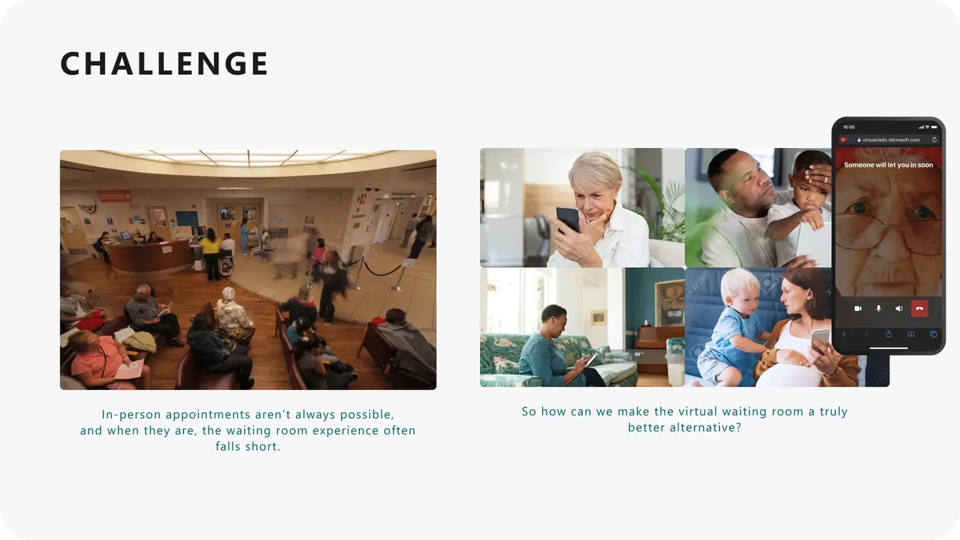
"I was waiting for some prompt, ping, noise, notification. Realistically from experience I was waiting for the window size to change, which is my indicator the meeting started."
Virtual appointment attendee
Design principles
Principles that guided decisions
Reduce cognitive load
Use sensible defaults so users can act quickly without second-guessing.
Reveal complexity progressively
Surface advanced options only when needed. Keep the primary path simple.
Make the next step obvious
At every touchpoint, users should know exactly what comes next.
Design for both sides
Patient and staff experiences must be considered together, not in isolation.
Exploration & refinement
From concept to shipped experience
Three concepts tested with schedulers, refined into a lobby chat pattern that shipped across scheduler, provider, and client surfaces in Teams.
Concept exploration
Proactive Scheduler Chat
Key Learning: Too rigid, felt like a form, not a conversation
Open Client-Initiated Chat
Key Learning: More natural but left some clients uncertain about what to say
Hybrid Approach
Key Learning: Best balance, guided yet flexible
Refined solution
Empty State
Clean, inviting lobby with clear next steps
First Run Experience
Onboarding helps schedulers understand the feature
Active Conversation
Focused, distraction-free chat interface
Multiple Clients
Organized view for managing concurrent conversations
"I like being able to check in with clients before we start."
Scheduler during usability testing
Scheduler experience
Providers manage multiple conversations simultaneously, sharing materials, setting expectations, and verifying readiness before appointments start.
Client experience
Clients receive real-time updates, communicate with providers, and transition smoothly into the appointment with full context and confidence.
Collaboration & leadership
How I led
I operated across product, engineering, and research to ensure the experience was cohesive, feasible, and grounded in real user needs.
Mapped the ecosystem across Teams surfaces and clarified ownership boundaries.
Facilitated alignment on the target journey and success criteria.
Partnered with engineering to validate feasibility early and reduce rework.
Collaborated with research to validate direction and de-risk key decisions.
Advocated for accessibility and clarity in high-stakes healthcare contexts.
"Within a couple of weeks of joining the team, Feven was handed a large project already in flight and was delivering designs. It's a complex space, and she handles the complexity and churn with grace and a customer-obsessed point of view.
When a directive came down that would have affected customers, she immediately raised the concern and worked across partner teams to find a compassionate way to execute it.
My plate was full leading the team, and Feven was my rock. I knew her area was completely taken care of, and she'd voice questions and concerns when she had them."
Design Manager, Microsoft
Decisions and tradeoffs
What we scheduled, and what we set aside
Every touchpoint in a healthcare journey is a choice between more information and less burden. These were the calls that shaped the visit.
Considered
A persistent group chat that lived after the appointment ended.
Chose
An ephemeral lobby chat scoped to the appointment window.
Why
Healthcare and enterprise customers needed a clear data boundary. Ephemerality reduced compliance load and matched how the conversation was actually used.
Considered
A single reminder pushed close to appointment time.
Chose
A staggered cadence of reminders tied to the user's confirmed actions.
Why
Pilot data showed no-shows clustered at specific friction points, not the hour before. Cadence beat volume.
Considered
Designing scheduler and provider on a shared canvas.
Chose
Provider as the primary surface, scheduler as a focused companion.
Why
Providers carried the most cognitive load during the appointment. Optimizing their flow first lifted every downstream metric.
Considered
A single confirmation email that let the meeting invite do the rest of the talking.
Chose
A consistent 'what to expect' pattern woven through confirmation, reminders, and the lobby itself.
Why
Attendees were dropping out at moments of uncertainty, not at the calendar step. Reducing uncertainty across every touchpoint mattered more than any single message.
Impact
Measurable outcomes
The redesign shipped across Microsoft Teams and shaped a new pattern for how virtual appointments communicate context before, during, and after a call.
15% faster scheduling
Improved scheduling efficiency by 15% through simplified workflows, sensible defaults, and clearer structure.
Readiness at ~20K meetings/month
Clearer pre-meeting guidance and proactive communication improved appointment readiness and successful joins across roughly 20K meetings a month.
Innovation recognized
Lobby Chat's pre-meeting communication model was granted U.S. Patent 12,418,630 in September 2025.
Fewer no-shows in client scenarios
Reduced meeting no-shows in customer service and healthcare scenarios by up to 15% through clearer pre-meeting communication.
Impact measured through a combination of feedback, usability validation, and product telemetry. Some data is confidential.
Looking ahead
What I'd do next
Expand guidance for edge cases, including reschedules, late joins, and cancellations.
Improve admin configurability without exposing complexity to end users.
Standardize content patterns for reassurance and clarity across industries.
Virtual Appointments reinforced that in high-stakes workflows, clarity is care. Designing across scheduling, communication, and live interaction surfaces required systems thinking, cross-team alignment, and careful tradeoffs between flexibility and simplicity. When uncertainty is reduced, people can focus on the conversation, not the technology.
Explore more work
People Skills
Led end-to-end design for AI-inferred skills across M365, Copilot, and Viva: trust and transparency patterns, admin controls, and the design system six product teams shipped against.
trov
A two-sided iOS rental marketplace designed and built solo: product strategy, brand, every screen, the React Native app, and the Postgres backend behind it.
Albertsons Pilot App
Designed the pilot that connected pharmacy guidance with grocery choices. 84% of pilot users reported greater awareness of healthier options, and its findings fed the app Albertsons later shipped.
Saver Fare Experience
Mixed-methods research with 60+ participants that shaped the Saver Fare launch, from renaming 'Choice' to 'Main' to the disclosure patterns that made fare restrictions clear before purchase.